
Welcome to your brand audit report.
A brand audit is an analysis of your brand from two views: an internal view – your team – and an audience view – your customers. The goal of this report is to find and address where these two views compete and lean into the areas where they harmonize.
AUDITED
Featherlane design co.
Auditor
Leah Sullivan
date
January 27, 2023
The Client Audit.
The Client Audit is the feedback received from the internal view through a brief survey overviewing the brand, company goals, and current audience.
Problem the brand solves
For homeowners and real estate agents alike, interior design can be a daunting feat that takes time out of their busy schedules.
solution the brand offers
Featherlane Design Co. offers interior design and staging for both commercial and residential spaces with expert strategy. Afterall, everyone deserves a beautiful space.
audit overview
There is a set of brand standards currently utilized, but there is no marketing support at the present time. The internal team manages the web and social media, but there is uncertainty around social media activity. Despite the lack of support, the small team creates a well-thought-out brand that is pleasing to the eye and well-fitting to their customer base – not an easy venture.
The current – and ideal – audience is primarily made up of homeowners (working and retired), CEOs, and Chattanooga transplants looking for expert help in the interior design realm.
Working from a referral-based marketing strategy, the team has lots of room for growth. The brand is well thought out and simply well done. The audience has been set, but the marketing is where the brand is left lacking. A beautiful brand deserves to be seen and known. We will review the outsider’s perspective in the next step.
The Internal Audit.
Similar to the client audit, an internal review was done by our creative director to see the brand from a customer point of view. Both online presence and social presence were reviewed in order to gauge the experience of a new and interested customer.
OVerview
initial thoughts | photography | brand tone | online presence
initial thoughts
The brand is lovely. It’s feminine, elegant, and has a welcoming tone on the first impression. To quote my first thought directly, “It’s simply nice. It feels inviting and warm while still feeling clean and expensive. The first impression is definitely a good one.”
photography
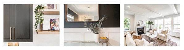
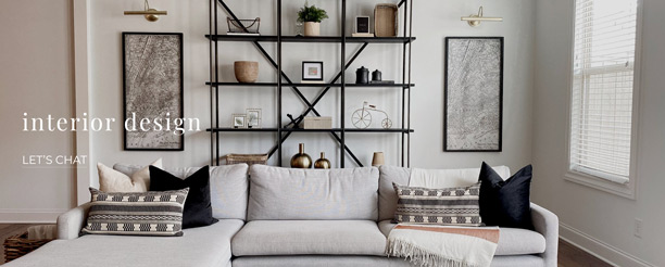
Photography is one of the strongest elements of the Featherlane Design Co. brand. The variety of compositions, mastery of lighting, and well-thought-out diversity of content create an environment to drive the heir of elegance home. See examples below.
brand tone
If the brand were to be personified and given a voice, it would speak in a gentle and soft tone with a light and cheerful harmony. The tone would be backed by confidence, even if a bit held back.
Overall, Featherlane Design Co. appears as a lovely, friendly brand with a clear understanding of its audience’s wants and needs.
Online presence
When searching for Featherlane Design Co., it is very easy to locate and a solid experience on the first click. The website makes it easily accessible and the social presence reminds the viewer of the impeccable skill of the team behind the brand.
The website is simple and aesthetically pleasing but could benefit from some user experience specifically in the menu formatting. The subpages explaining the services further are a bit sparse on information leaving the reader looking for more. Expanding this content would also create a more robust SEO allowing more viewers to find the site.
After some viewing, I realized I had skimmed over the shop section due to its placement in the menu. The shop area is simple and clean but would benefit from filtering and grouping options to increase usability.
Messaging
Product descriptions | Mission and tags | Overall Copy Review
service descriptions
The copy provided to explain Featherlane’s service is quick, easy, and to the point – but this is almost to a fault. The user is not able to spend much time learning about the offerings leading them to a “join now or leave” ultimatum. To combat this one or done effect, I would suggest expanding these pages, detailing processes, and providing testimonials, case studies, and other content to expand the page.
MISSION AND TAGS
There is a mission statement buried within the homepage of the website stating “We are committed to uncovering the innate potential in people and spaces. We focus on bringing interior design approaches that will enhance your life and your home, because every house deserves to feel like home.”
This is a beautiful message well explaining the experience and purpose of this team, but there is a need for it to be proclaimed across the brand more instead of at the bottom of the home page.
Outside of the mission, no supporting taglines are consistently used in the brand. This would be an opportunity to expand the content and provide viewers with a more personal look into the personalities behind the name.
OVERALL COPY REVIEW
Overall, the copy is well written, but just needs a little push to the next level. Allow a bit of vulnerability, honesty, and expansion to give your viewers a reason to stay and enjoy your offerings.
VISUAL ASSETS
ICON | WORDMARK | VISUAL ASSETS OVERVIEW
ICON
There is no icon outside of the wordmark.
WORDMARK
The wordmark is a simple and nostaligic lowercase serif that brings a soft and gentle voice to the brand. The wordmark stands well on its own and is friendly to most application formats. There are no quality issues to be found.
VISUAL ASSETS REVIEW
In combination with the soft tones, stunning photography, and skilled product offerings, the visual assets don’t need an expanded palette. Allowing the personality to speak for itself creates a calm environment perfect for the audience and brand alike.
Conclusion
Harmonies | Discrepancies | Overview | Prescribed Next Steps
Harmonies
The visuals are well done, “picture perfect”, and support the brand tone extremely well. The personality sings with warmth and femininity while showing confidence in its knowledge and skill set.
Discrepancies
The main discrepancy with the brand content is the copy. What is there is doable to explain the services, but that is about it. The viewer is not able to learn much about the values, mission, or purpose of the brand outside of the most literal offerings.
Overview
The harmonies vs the discrepancies prove that the missing pieces will be easy to fill. The foundation of the brand is very solid, but the copy needs to be more open.
By addressing the copy and marketing tactics around the brand positioning, increasing brand awareness and potential product sales could scale quickly.
Prescribed Next Steps
Saint Emblem specializes in story-defining branding. This means your story comes first in all aspects of your brand, including your copy. To do this most effectively, Saint Emblem would prescribe a brand-story consultation to aid your team in defining your brand’s story and discovering ways you can share it efficiently and effectively. In addition, Saint Emblem is happy to aid in your journey to expanding your copy and marketing strategy more specifically based on your timeline, budget, and goals. These options can be discussed during or after your brand-story consultation.


