Kentucky Bourbon Aging Co.

2023

Brand Presentation

Message/Tagline

Brand Marks/Elements

Color/Typography

The brand advantage of KYBAC is there is more of a consumer attraction aspect to the model than some other investment funds. Bourbon carries a status factor to it, it’s viewed as an experience as much as it is a product.

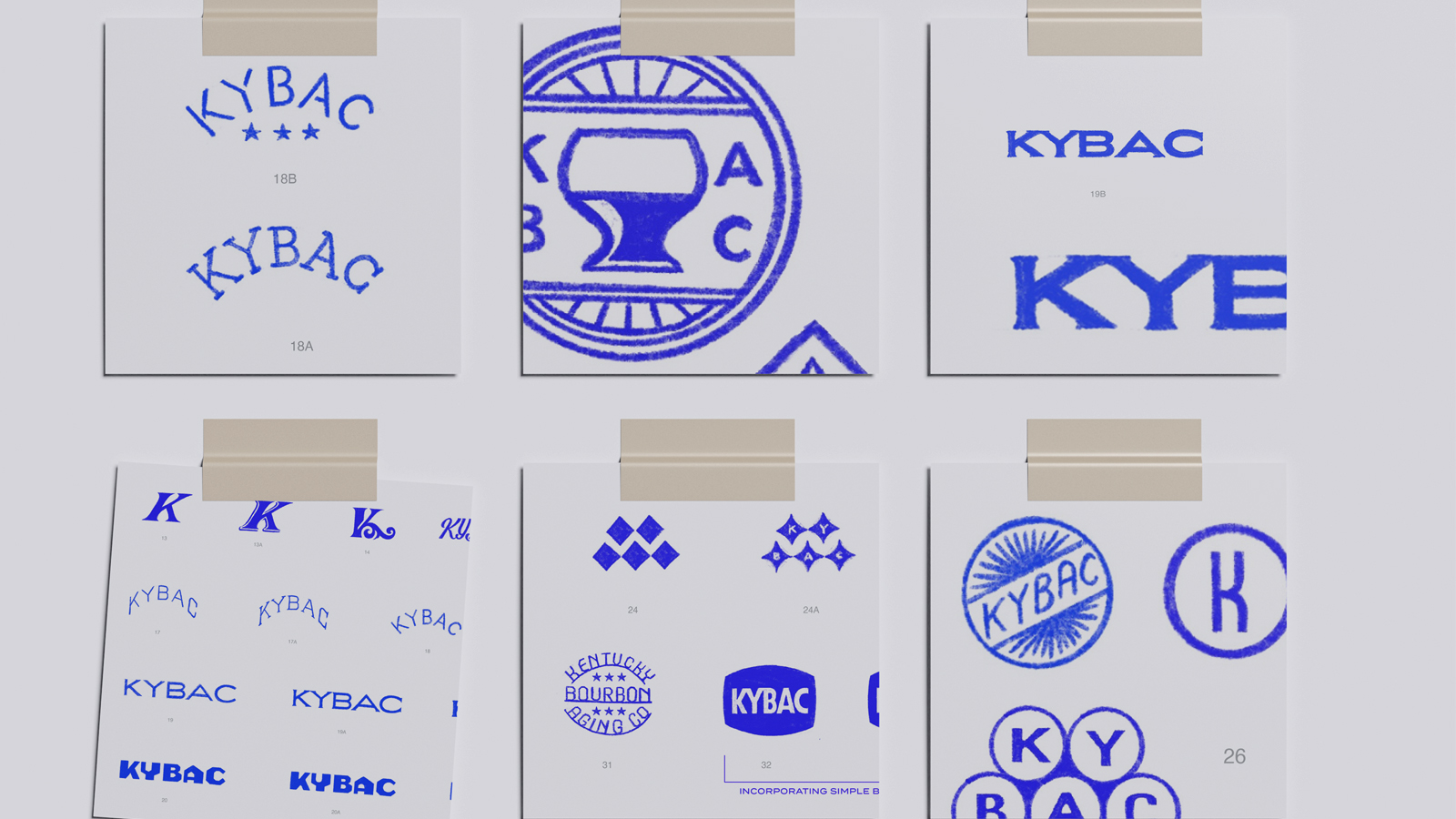
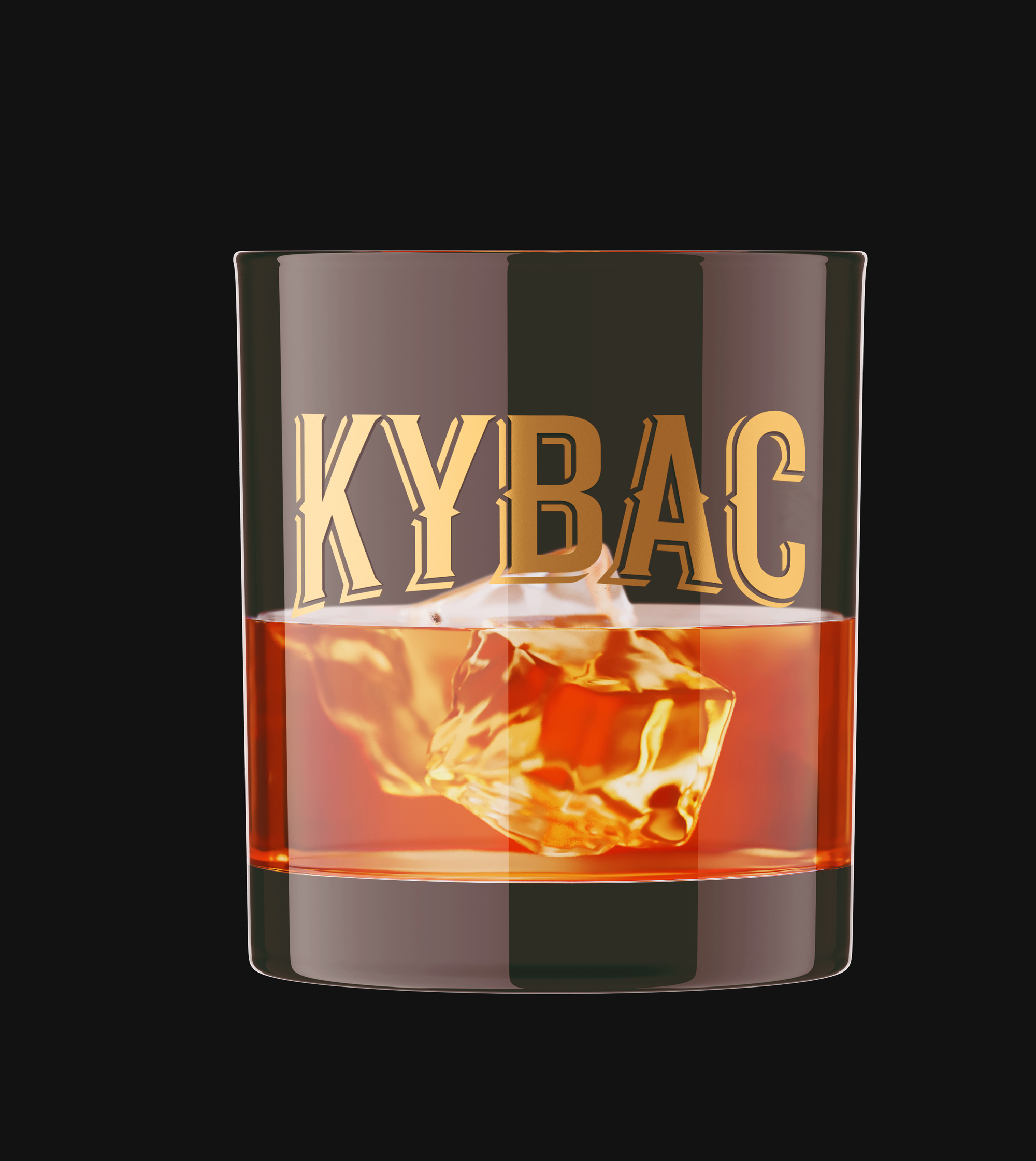
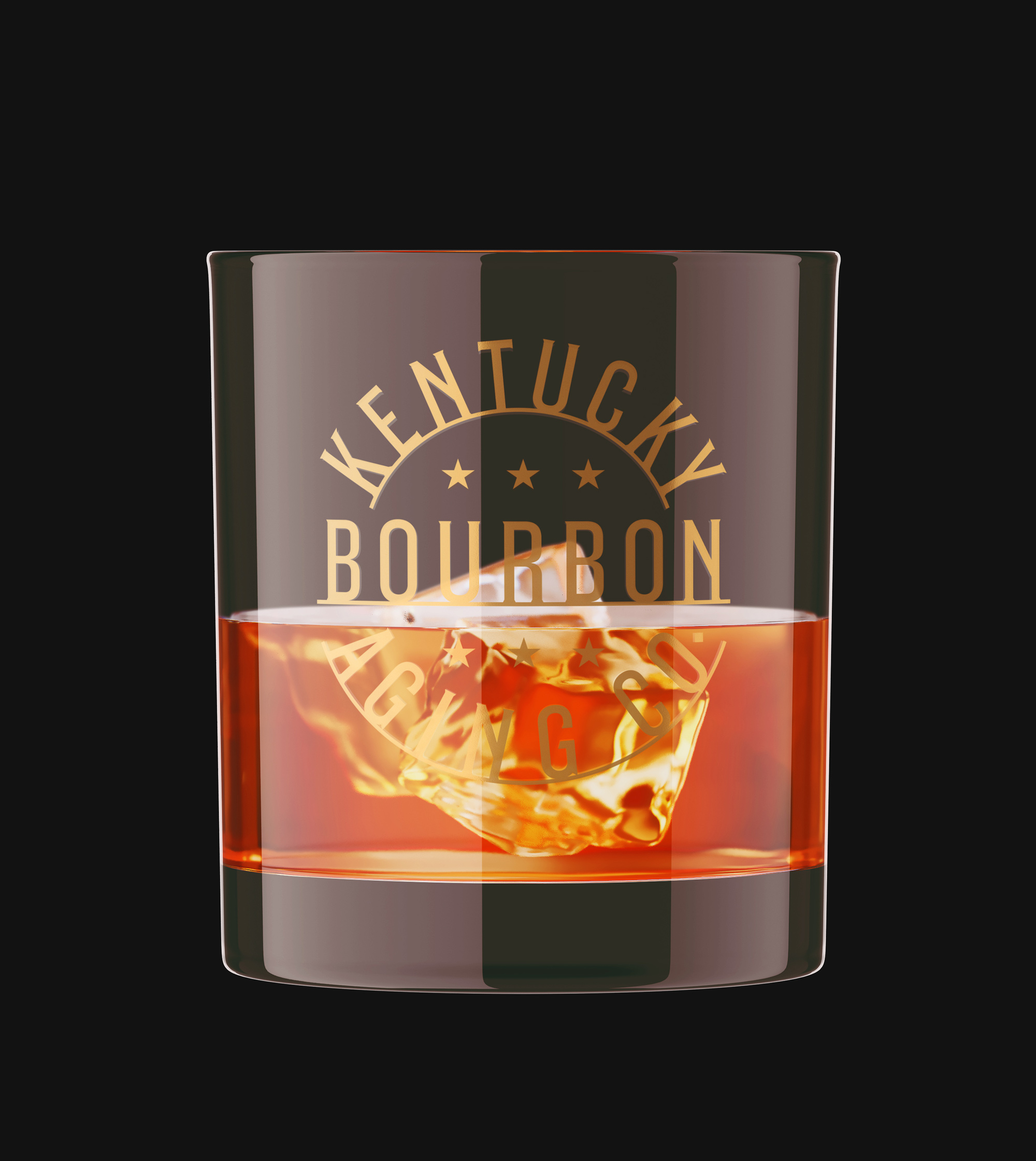
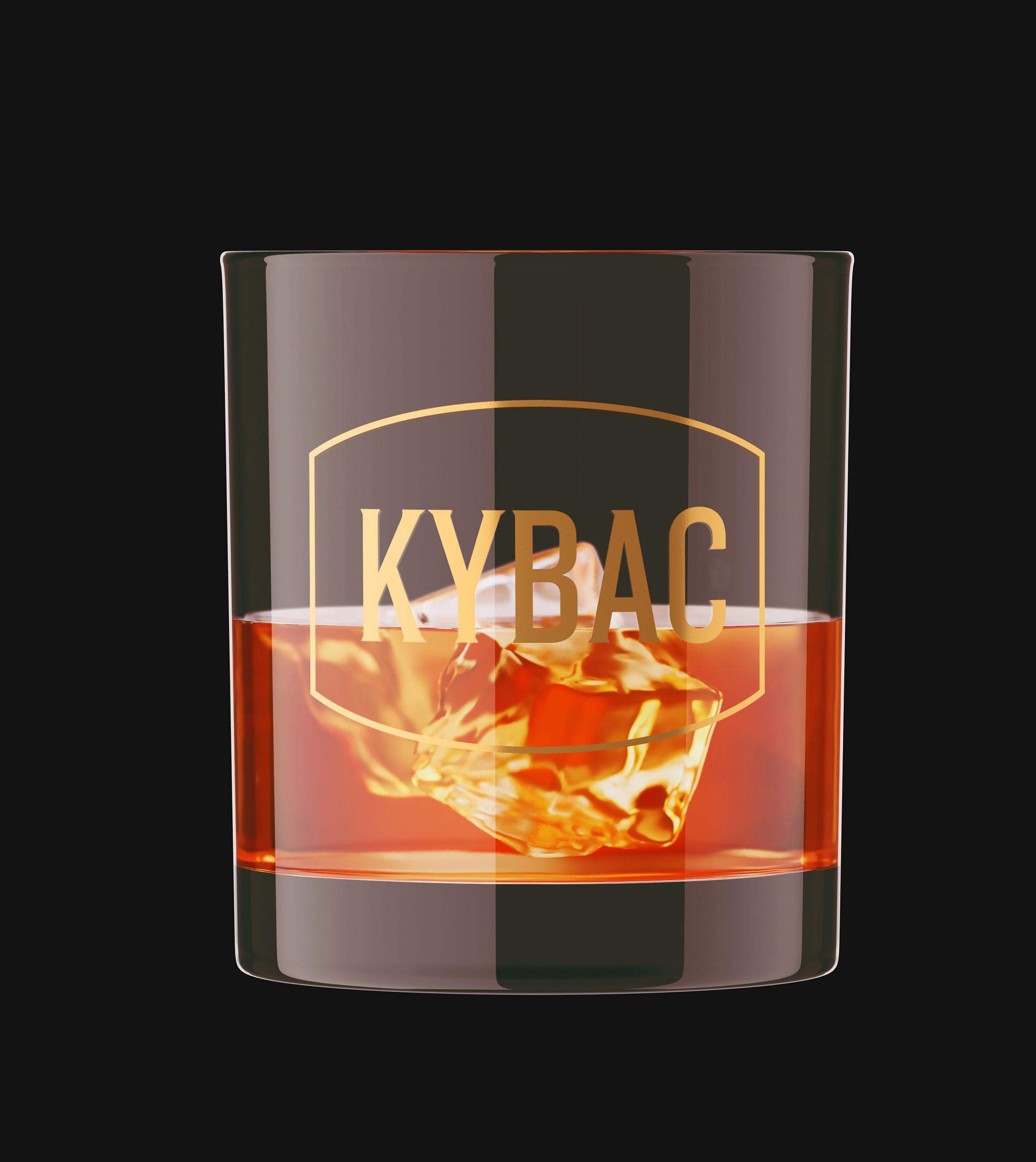
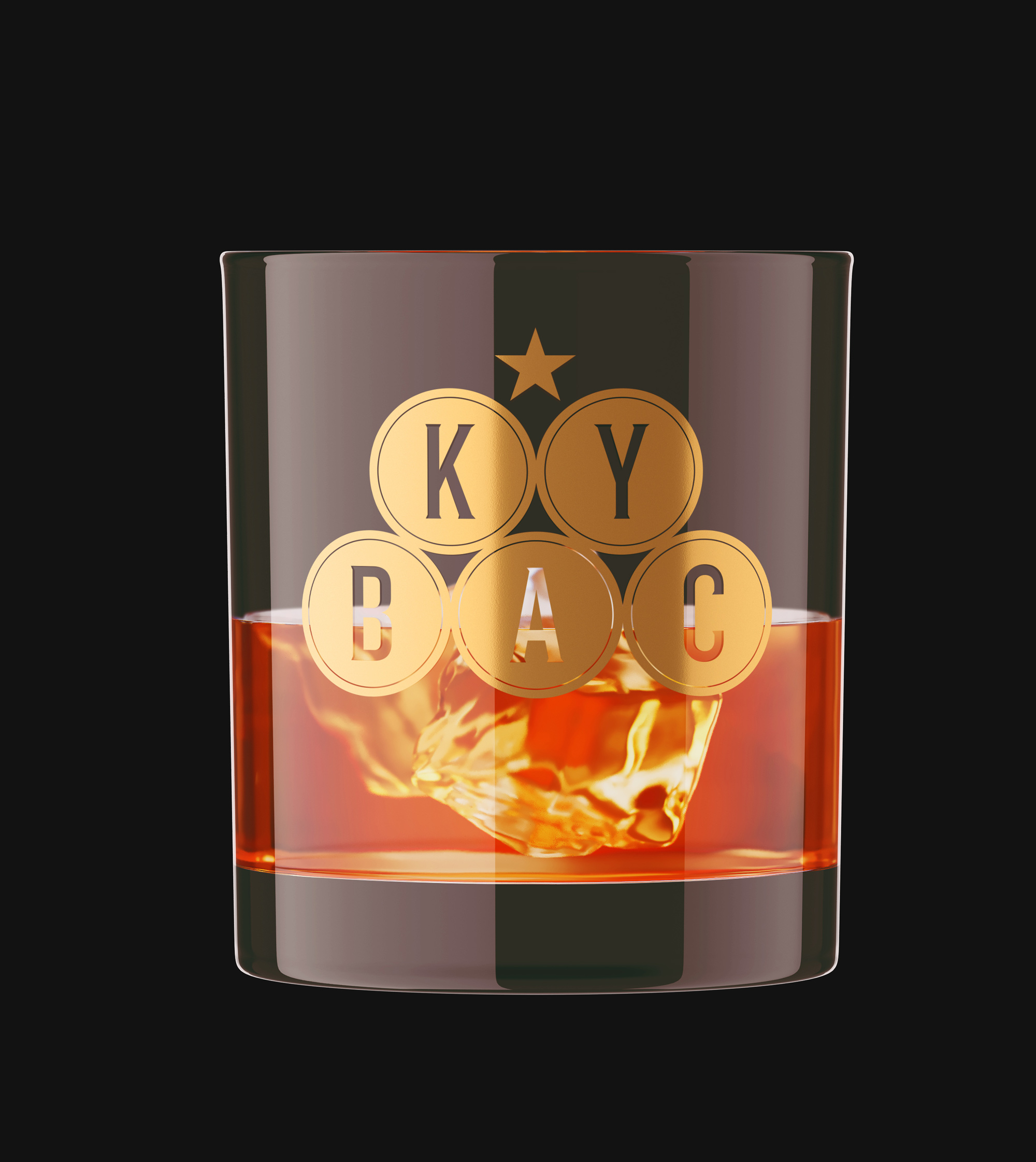
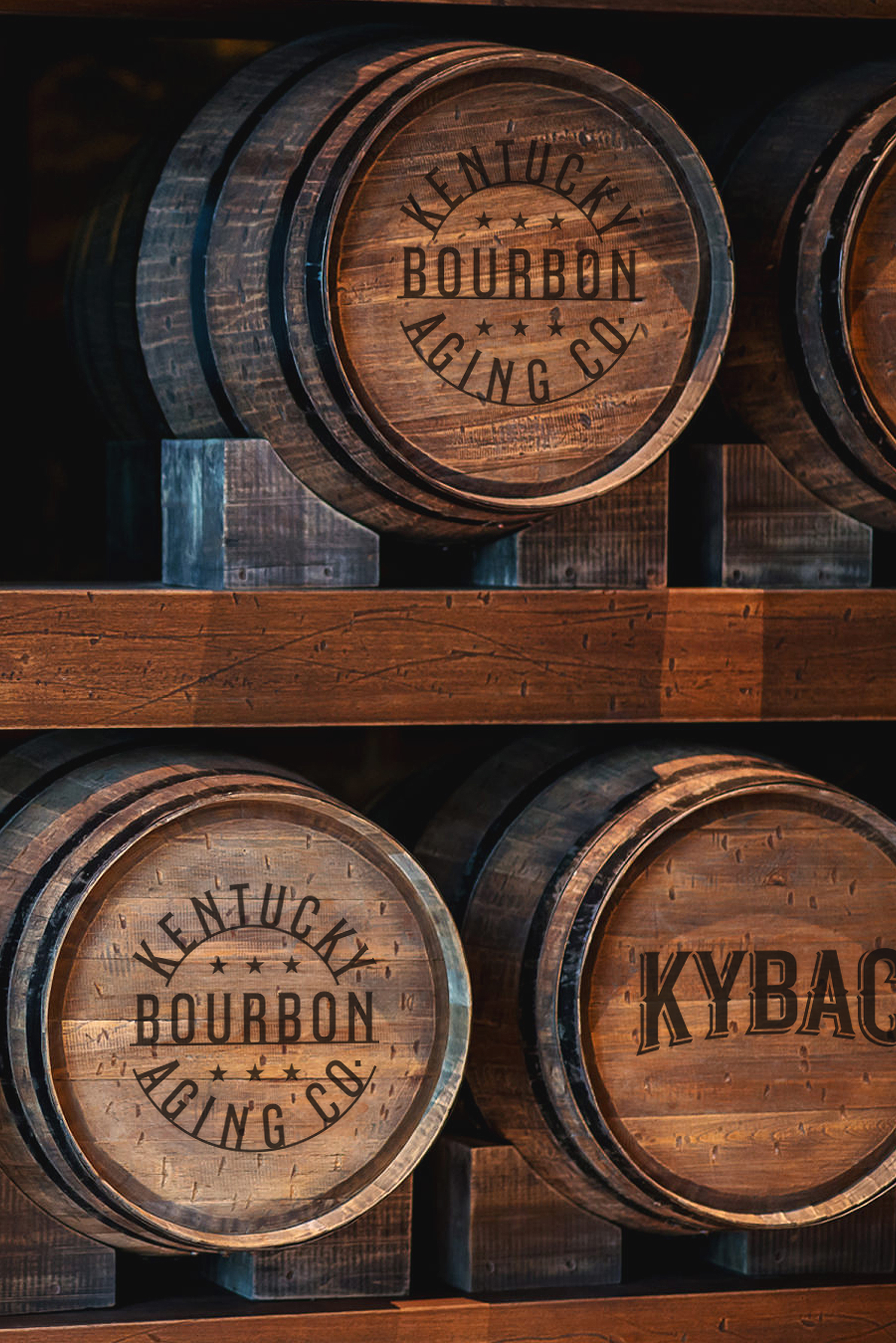
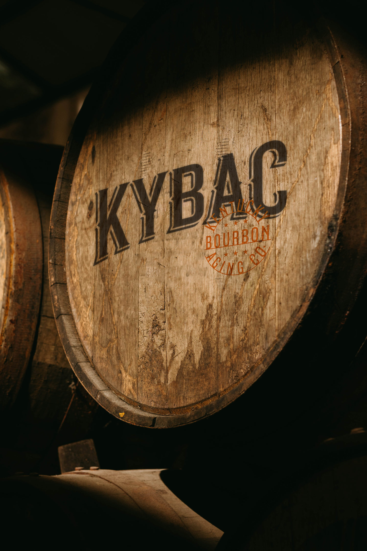
The new brand marks, palette, and messaging platform will embrace that experience and offer the investor a glimpse into the making of their investment. The new marks are uniquely built for KYBAC, creating a solution that can be replicated on digital, print, and fabric mediums consistently. 

Primary Tagline

Build a legacy by the barrel.

The core messaging and short-form lines should carry a variety of tones. More non-product feature-specific angles should offer a sense of inspiration and curiosity, allowing the viewer to interpret what these words mean to them and how they can imagine themselves in your brand story.

Product-specific messaging should still be creative but more direct to what problems your product solves. 

Secondary messaging

Liquidity has never been smoother.

Your guide to Bourbon investing.

A tasteful investment.

Brand Mark process
Arrival

Homework pays off. We leaned heavily into our research, moodboarding, target audiences, and industry to arrive at truly storytelling marks. The ideation process went into several hundred individual concepts through multiple stages.

The result was not one but several appropriate and tactfully useful primary and supporting brand marks. Each of these are institutional enough for the financial industry, however maintain the thematics that make bourbon sexy.

Brandmarks/Elements
Wordmark

The KYBAC wordmark is custom-built with a nod to traditional alcohol-based typography in subtle serifs and angles. This solution is functionally sound and appropriate to use in the more foundational needs the investment messaging will require. 

The horizontal version is intended to make a clean read from left to right while carrying fashionably wide letter spacing. The horizontal version will be the primary wordmark and used in applications that allow well for its size, like web headers and stationery. The vertical version is intended for smaller spaces that are more square in ratio versus the long format. This will allow the characters to maintain their readability in tighter conditions. 

brand Icon

The KYBAC icon is a custom-built graphic intended to embody the personality of the tangible product. Bourbon historically carries a status factor in its visuals, using custom typography with scrolling and depth. The KYBAC icon is the simple acronym built to look like it would belong on a bottle label, this helps reinforce what the investable product is, considering it will not be present in a drinkable sense.

While many Bourbon brands are more ornate and decorative, the simplicity of the icon is intentional. The brand should speak to Bourbon as a product, not shout it. The icon’s clean non-ornate lines and subtle spurs offer the tone of an alcohol brand while still being tasteful and structured enough for the investment audience.   

Alternative Acronym Marks
Icon Stamp
Brand Icon rationale

It's the little things.

An angle that the KYBAC investment model carries that many funds do not is the marketability of the investment product. Many new brands gain traction quicker due to their consumer appeal visually. The goal with any brand, and especially one with the monetary investment level of KYBAC, should exude confidence and help the viewer feel like they are in the distillery tasting room themselves. KYBAC can take advantage of that philosophy through branded merchandise opportunities that can display the brand in the same promotional items our audience would use in the high-end bourbon drinking experience. 

Color

Color inspired by nature.

Any color palette should provide a mood and inspire, allowing it to speak on behalf of the brand even without other elements present. The KYBAC color palette pulls tones directly from the product and process (Amber, Oak) itself while merging with more foundational colors (Bronze, Blue, Silver) that evoke wealth and structure. 

Benchmark Bronze

#A08662

Asset Amber

#E56700

Spirit Silver

#D5D1CC

Kentucky Blue

#6D9093

Charred Oak

#3C3A39

Typography

Versatile San-Serif with eighteen weights for all production uses in digital and print communications.  This Google Font should be used primarily in product and technical-specific copy due to its readability at smaller sizes.

View and download
  • Body Copy – Extra Light, Light, Regular
  • Sub-Headlines – Light, Regular, Semi Bold, Bold
  • Technical Information – Regular, Semi Bold
  • Call-Outs – Regular, Semi Bold, Bold

Stylish Serif Google Font with fourteen weights intended for product marketing and story-driven headlines, quotes, and short-form supporting headlines.

View and download
  • Large Headlines – Regular, Medium, Bold, 
  • Sub-Headlines – Regular, Medium
  • Drop Quotes – Regular, Medium, Italics

Stylish Serif Google Font with five weights intended for product marketing and story driven headlines, quotes, and short form supporting headlines.

View and download
  • Numerals