Wander and Perch

2022

Brand Presentation

Message/Tagline

Brand Marks/Elements

Color/Typography

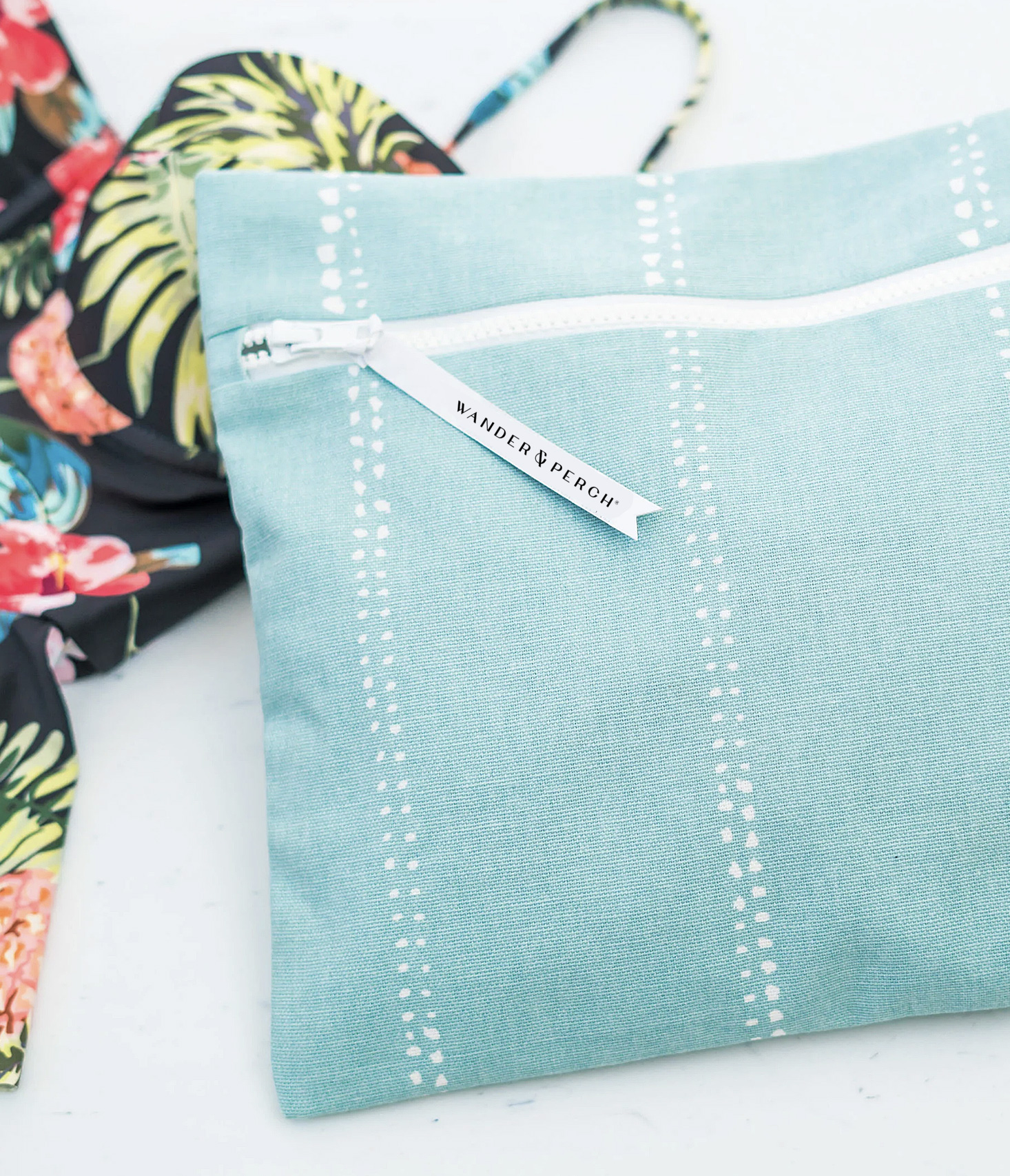
The brand advantage of Wander & Perch is it is always part of an experience. While the product is the common thread, the landscapes, people, and activities are always evolving.

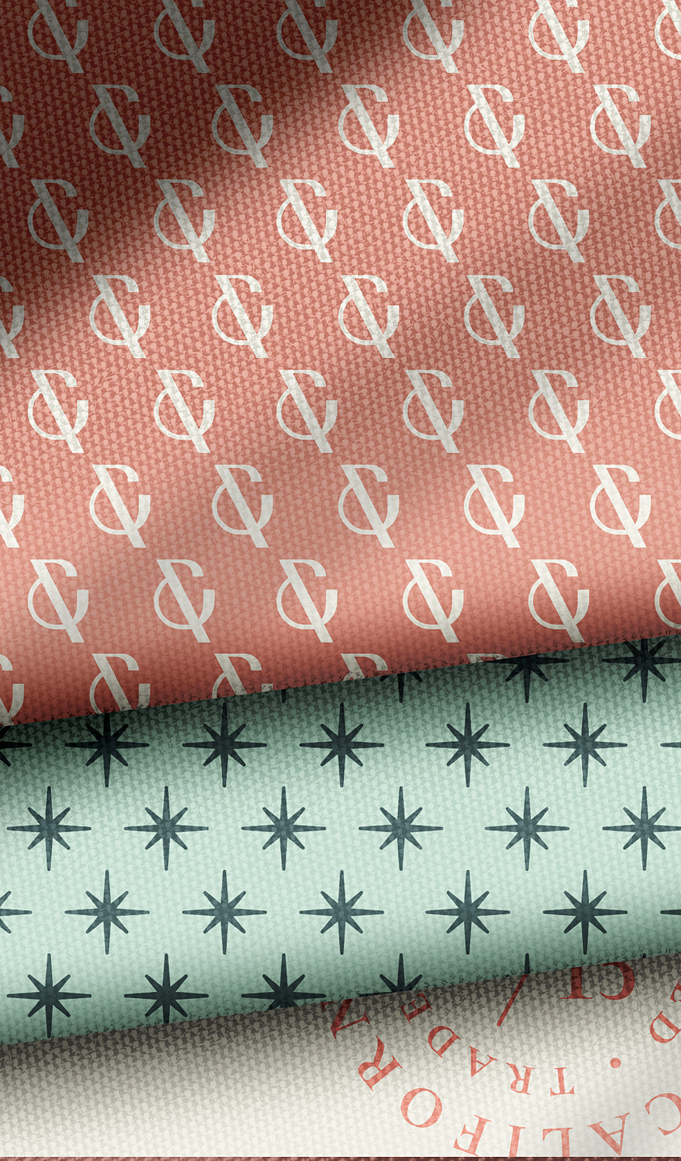
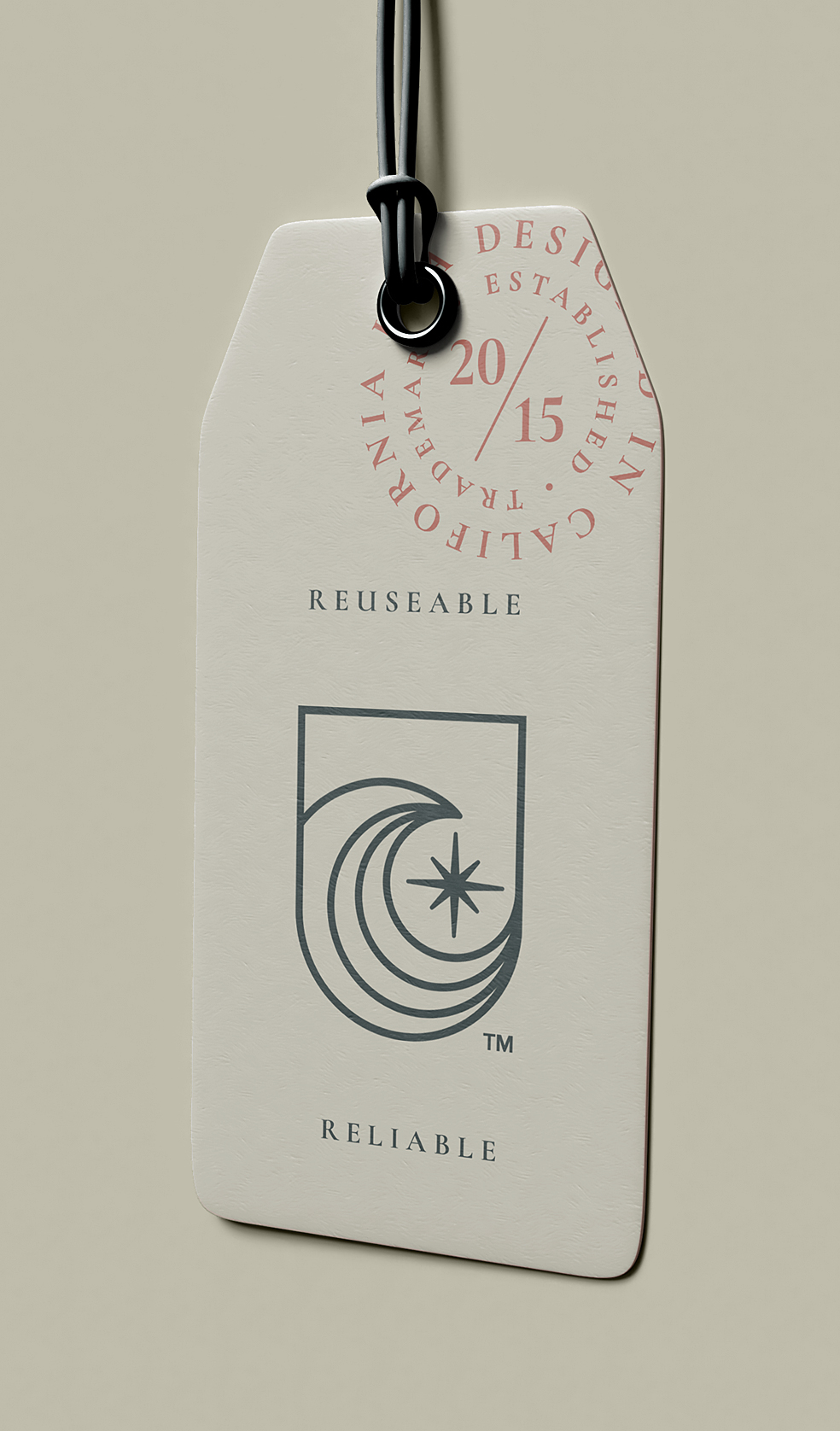
The new brand marks and palette will allow for more versatility in applications, removing past variables that harmed consistency. The new marks are uniquely built for Wander and Perch, creating a solution that can be replicated on digital, print, and fabric mediums consistently. 

Message/Tagline

Enjoy Today. Wander Tomorrow.

The core messaging and short form lines should carry a variety of tones. More non-product feature specific angles should offer a sense of inspiration and curiosity, allowing the viewer to interpret what these words mean to them and how the can imagine themselves in your brand story.

Product specific messaging should still be creative but more direct to what problems your product solves. 

Brandmarks/Elements
Wordmark

The W&P wordmark is custom built with two different line weights making up portions of each character. The goal is to allow for ease of use and readability regardless of application type. The san serif solution is intended to make a clean read left to right that is feminine but neutral enough to appeal to all audiences while carrying fashionably wide letter spacing.

brand Icon

The W&P icon is also a custom built graphic consisting of one line-weight. Again, functionality is key with this design in thinking ahead for applications such as screen printing, embroidery, or digital. 

An brand icon should never take too much on and attempt to tell too much of your story. It simply needs to convey an understandable visual theme that represents an emotion you want your audience to take away from it. In this case we feel representing environments our users are in through the movement of water. The “star” is one of those interpreted aspects; with viewers able to see the sun as well in the horizon behind the wave, either way it’s mean to be directional goal on their journey. 

Established 2015 stamp
TAG CONTAINER
Vertical and Horizontal Lockups
Patterns
Brand Icon rationale

It's the little things.

An important feature that the brand lacked previously was containment. Many of the current and future uses of the W&P icon will require some sort of border or containment, so we have built into the emblem. This is also an important homage to the product that started it all, the Wetbag. The emblem acts a place to put what’s important and keep it protected. 

Color

Color inspired by nature.

Any color palette should provide a mood and inspire, allowing it to speak on behalf of the brand even without other elements present. The Wander and Perch color palette pulls directly from the environments a customer may find themselves in without carrying more traditional tints seen in other brands. The goal is to be unique enough to stand out but soothing enough to establish a mood.

H20

#183339

C 58 M 11 Y 0 K 78

R 24 G 51 B 51

PMS 5467C

Palm Sage

#3B5151

C 27 M 0 Y 0 K 68

R 59 G 81 B 81

PMS 5477C

Carefree Blue

#ACCFBC

C 17 M 0 Y 9 K 19

R 172 G 207 B 188

PMS 566C

White Sand

#EEEBDA

C 0 M 1 Y 8 K 7

R 238 G 205 B 218

PMS 

Solar

#EA8D43

C 0 M 40 Y 71 K 8

R 234 G 141 B 67

PMS 7577C

Coral

#EC8173

C 0 M 45 Y 51 K 7

R 236 G 129 B 115

PMS 170C

Cali Clay

#A76252

C 0 M 41 Y 55 K 35

R 167 G 98 B 82

PMS 7522C

Gradient: Coral to Carefree

Gradient: Palm to Carefree

Gradient: Coral to Solar

Gradient: H20 to Palm

Typography

Versatile San-Serif with seven weights used for all production uses in digital and print communications.  This Google Font should be used primarily in product and technical specific copy due to its readability at smaller sizes.

View and download
  • Body Copy – Extra Light, Light, Regular
  • Sub-Headlines – Light, Regular, Semi Bold, Bold
  • Technical Information – Regular, Semi Bold
  • Call-Outs – Regular, Semi Bold, Bold

Stylish Serif Google Font with five weights intended for product marketing and story driven headlines, quotes, and short form supporting headlines.

View and download
  • Large Headlines – Light, Medium, Regular, Semi-Bold, Bold, Italics
  • Sub-Headlines – Medium, Regular, Italics
  • Drop Quotes – Medium, Regular, Italics
next